What we love & hate about iOS 4
The new iOS 4 for the iPhone is now out and we have been working with a developer version for the last few weeks. Here is our list of our favourite and least favourite parts!

What we love...
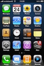
1/ Folders- life is much simpler now, with only 2 screens worth of icons. We like to leave the front screen for the most part as Apple intended, and we now have all of screen two containing folders. Just so much more convenient to find things and organise icons.
2/ Camera zoom- ok so it is digital zoom and not true zoom, but it is great for framing a shot and having some way to focus on our subject
3/ Text character count- now we know how long our text messages are- and we like to know this
4/ Combined inbox- we love this and hated all of the old switching back and forth. We also like the threaded messages where they are grouped together when from the same conversation. Nice touch.
5/ Multiple select in camera roll- many times we have synced our photos with iPhoto but left them on the camera roll, and we then wanted to delete them later. Now there is the option to select multiple pictures on the camera roll and then delete them all in one go. Same goes for selecting multiple photos and attaching them to an email- no longer do you have to send each picture in a separate email.
6/ Notes sync- at last. Now you can sync your Notes with Mail notes in OS X, wirelessly over MobileMe. This is the same method as the contacts, calendars, bookmarks and mail accounts sync, and we just don’t know why it was not there from day 1.
7/ Rotation lock- we like this option and are surprised that we love the lock button on the iPad (and don’t miss a mute button).
8/ The new Contacts template- we like the layout of the new contact screen; better than previous version and less tapping back and forth.
9/ Calendars- we love the ability to hide or show calendars. This means we can view say 4 our of our 7 calendars and exclude some for now. In the past you had to view all synced calendars, with no option to hide some of them.
10/ Ability to sync subscribed calendars- excellent. We have a lot of subscriptions and were lost without them when out and about with our iPhone only.
11/ Spotlight search- much more ubiquitous now and we have used it a few times, whereas we never used it under 3.2. The ability to search through emails on the server is also great.
12/ Playlists in iPod- the ability to create and edit a playlist is very handy.
What we hate...
1/ Multitasking- um yeah. Not sure about this. We like the concept, but really. Now when you double-press the home button, you see a panel of all open and recent apps. But so what- we don’t get it? Are we expected to close them all and tidy this list ourselves? It just seems to us to be a bit annoying, even if the promise of extended multitasking is good. We preferred when we could set the double-press to our open favourite phone contacts. By the way, Apple always had multitasking on the iPhone- it was just restricted to certain apps, such as Mail, Phone and iPod. Maybe we just hate this right now, and more is to come in the future...
2/ Wallpaper- we just think it looks messy. First step was to download a nice simple wallpaper and not use a photo or design behind the icons. This offended our aesthetic sensibilities!
3/ Unified inbox is ONLY inbox. What about unified drafts, unified sent, unified trash and junk!!! Now moving from one sent folder to another feels even more inconvenient than ever.
4/ Bug/feature with unread messages on MobileMe- ok maybe this was not to be fixed in iOS 4, but we still hate the fact that if we read a MobileMe message in our OS X Mail inbox, the number on the Mail icon on the iPhone only updates itself after you go into the Mail app. It count does not auto-update itself. Apple support document on this here- http://support.apple.com/kb/TS1795
Dr. Simon Spence/2010
blog comments powered by Disqus
