Loving the New MacBook Pro
I have been through a few Apple laptops families over the years. I started with a black PowerBook G3 in the mid-90s and then moved to a titanium PowerBook G4. I didn't move to an iBook, even when they became sleeker with the white plastic design, but instead stuck with PowerBook and MacBook Pro until the MacBook Air emerged. This finally encouraged me away from the top-of-the-line models, as the slim and yet powerful MacBook Air offered me the flexibility of a thin laptop, but with enough power to drive an external display and complete all the tasks I needed. I generally boosted the processor, such as the i7 in my last model, so the size, weight and engine matched my needs.
However this October, Apple launched the new range of MacBook Pro and I was left with a choice. The MacBook Air family looks dated with no Retina display, so my choice this year was a new sleek and thin MacBook or to jump back up to the top of the line MacBook Pro. I decided on a 13" MacBook Pro for two reasons- the screen size (13" vs the MacBook's 12") and the new TouchBar technology.

After one week of use, I have no regrets. The display is crystal-clear and it is only after you have worked for a while with these displays that you realise you can't go back. Like the iPhone and iPad Pro, the text is smooth, images are clean and elegant on this screen. I also enjoy the extra space compared to my old MacBook Air's 11" screen.
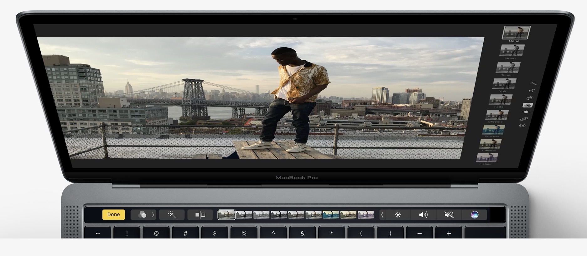
But the real headline here is the TouchBar. Part of this is its existence, and part is its use. The existence of the TouchBar just makes the laptop feel new and feel more sophisticated compared to the MacBook Air and the previous MacBook Pro. It is a whole new way to interact with the laptop and that makes it look and feel like a new generation and not just a minor upgrade. Along with the black trim and thin bezel around the display, the TouchBar makes the MacBook Pro look new and fresh, and the MacBook Air by comparison looks "old" and quite outdated.

In use, it is smart and intuitive, even if it is a work-in-progress. For example in Mail, the Touch Bar offers suggestions on where you would like to file emails. If you select an email in your inbox, it knows which mailbox you normally place emails from that person, and files the message in one tap. The change, after years of dragging and dropping emails, is astonishing. I still only use about 30% of the buttons in the TouchBar and it may be that over time I customise them more, but what I do use I love and it makes a difference to my speed. This is especially true with the Touch ID sensor at the end of the TouchBar: unlocking the Mac and using my 1Password app is so much quicker.
I am also positive on the ports and possibly even hostile to all of the noise over Apple's move. The ports make complete sense. Four USB-C ports, no longer requiring me to look at the end of the cable to ensure I am about to plug it in the right way, just shows how bad the old USB standard was. USB-C is the way forward and we jut need to get on board. Yes I have bought a few adaptors, but so far I have used a USB-C to USB adapter twice for about ten minutes, used to plug in a USB stick and back up my iPhone.
About the only thing I don't like is the USB power adapter. It seems to have had less thought put into it. It is a shame it is so big and the USB-C cable which runs from the adapter to the laptop is thick and slightly clumsy. But overall, this is a minor concern.
If you are ready to move into the future of Mac laptops, dive in. If you love your current (and old) peripherals, the move will be more painful and expensive. But in the end I recommend this laptop as it is a clear break from the past and a beautifully designed Mac.