Thoughts So Far on the Apple Watch
After my first 24 hours with the Watch, here is a list of likes and concerns so far:
Likes-
- I bought a sports watch with the black rubber strap and it is very light and comfortable to wear. I gave up wearing a watch about 8 years ago and have been surprised at how unintrusive the Apple Watch feels on my wrist
- it looks good- a little thicker than my dream Apple Watch (!) but very neat and sleek
- I have been pleasantly surprised on how fast I have learnt the OS. I was expecting it to be more complex, probably due to the reviews I had read. But having watched the Apple videos in advanced, I have used the Watch without having to search for answers online. This may not be everyone's experience; I think it depends on expectations
- the packaging is a work of art, and the UK/IRL charger plug is brilliantly thought out
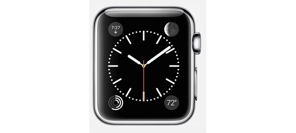
- my favourite parts of the OS are: the customisable clock faces, messages and answering calls!
- after 24 hours the battery stands at 40%. This is better than I expected. My iPhone battery is also higher at the end of the day as I spent less time using it- a lot less!
- the heart rate sensor is very interesting but I'm not sure I trust it just yet. A few readings were out of the general pattern for say an hour, and for no apparent reason. I am either doomed or the sensor can produce the odd glitch and we need to focus in the average. But overall I think it is a great health addition
- I like the activity features and how the Watch bugs me to be healthier. The prompt to stand up and move around may not be everyone's thing, but I like it
- best third party app so far- 1Password. A useful app where you can store a few crucial bits of info
- the best non-core Apple app has to be Remote- controlling my Apple TV from my wrist is very cool

Concerns-
- I thought that the charger would have a stronger magnetic attraction to the back of the Watch. It's not a major problem but I did find myself reattaching it a few times to be sure it was charging
- I'm not 100% convinced by the need for the Friends button- it might be somewhat handy, but a dedicated button for this? On the issue of buttons, I seem to be using the digital crown far less than iwas intended. Both buttons for me are a last resort
- not being able to reply to an email is disappointing. There may be very good reasons why it's not available as an option, but it seems like a gap in the features. I know this will disappoint some users
- I wish I could remove or hide some of the built-in apps to make the remaining apps on the app screen slightly larger. Right now those icons hover between usable and fiddly
- Siri has been almost good. But, for example, if there is a mistake in your message, you have to cancel and start the message again. It is not as effective as Siri on the iPhone
It will take a few days for me to have a fuller view on the Watch and how I will incorporate it into by daily routine, but so far it has been very useful. Plus it has kept me away from my iPhone and has saved time by allowing prompt responses to messages and quick reading of emails.